|
|
Post by Sydney on Aug 1, 2015 1:55:37 GMT
|
|
|
|
Post by Tpgettys on Aug 1, 2015 2:51:33 GMT
That is so cute Sydney!
|
|
|
|
Post by Lillias on Aug 1, 2015 9:16:39 GMT
Great dodo eggs jackscrap. One of them would keep me going all week. hmca – I just love OOB's tpgettys - Potlights – what fun and imagination. Lots of imaginative pages for this.  |
|
verber10
Junior Forum Member
 Best wide-angle lens? Two steps backward. Look for the 'ah-ha'. The Mitten State
Posts: 204 
|
Post by verber10 on Aug 1, 2015 15:02:12 GMT
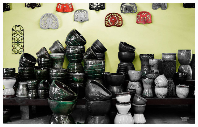
Thanks Tom for this weeks image. Great job everybody!  After I looked at all these entries I was at a loss of what to do. OOB, Sketch, Cube, and everything else had been done already. After I looked at all these entries I was at a loss of what to do. OOB, Sketch, Cube, and everything else had been done already. So I went into Lightroom and made 2 copy's of it. One I made a high contrast B&W, the other I made B&W with selective coloring. Red & Green. Then I opened them both up in PSE and used Soft Light Blending mode. After that I thought the wall needed some color, so I selected it and changed the color. I know it's not much, but I did kill a couple of hours this morning making it. 
 |
|
|
|
Post by hmca on Aug 1, 2015 16:05:03 GMT
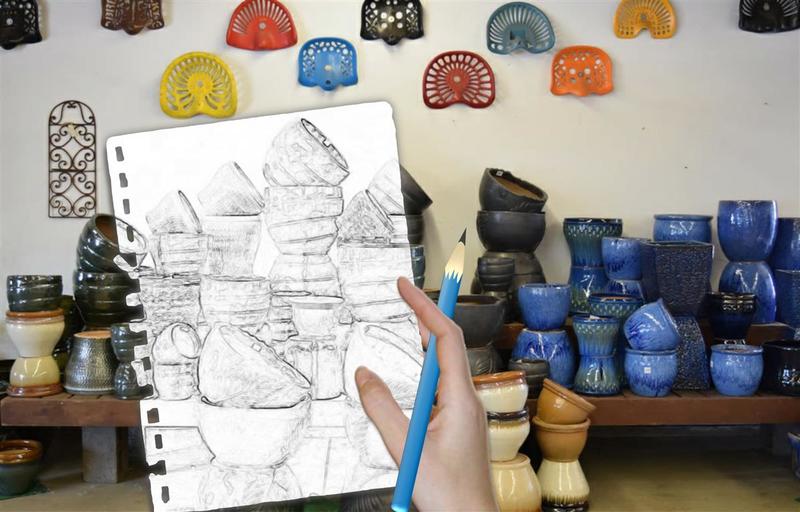
Tom, I was going to say clever....but I like Sydney's term better....Brilliant indeed!!!!
Billie Jean...love your sketch idea!
|
|
|
|
Post by Tpgettys on Aug 1, 2015 17:18:58 GMT
The sketch idea is clever indeed; that is one I need to remember!
Mike, I do like what you did; it definitely became a much more interesting image!
|
|
elines
Junior Forum Member

Posts: 139  Open to constructive criticism of photos: Yes
|
Post by elines on Aug 4, 2015 19:12:00 GMT
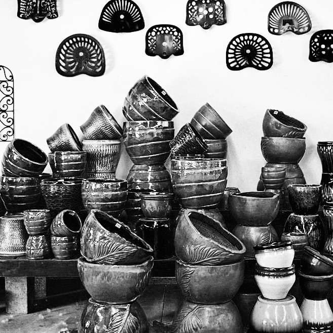
Here is my effort - conversion into B&W as usual 
I am still into B&W as, for me, it seems simpler than dealing with loads of colours - can't cope with them

It seemed to me that the tractor seats(?) were the interesting part of this picture - but this may be because I remember seeing ?not many - when I was a young lad many years ago.
On reflection, if I were to do it again I would probably make it more of a landscape format to make the tractor seats occupy even more of the available space. And maybe tone down the brightness of the pots in the bottom right hand corner.
In fact I'd make quite a few changes really  |
|