|
|
Post by uknomad on Sept 29, 2015 8:40:09 GMT
Morning All, help please!
Using PSE 11
If I use the quick selection tool to select for example a person within a photo and then use the move tool to resize that selection by making it smaller, it leaves a black shadow between the new smaller selection and the original.
What am I doing wrong to reduce the size of the selection please and how can I prevent/avoid it happening?
Many thanks!
|
|
|
|
Post by cats4jan on Sept 29, 2015 10:55:19 GMT
When you open a photo which is a jpg, it opens as a background layer. Look over to the layers panel and note if it says "background"
When you delete part of a photo from a background layer, you leave behind the background color.
Look to the little color boxes on the left. You probably have white set as the foreground color and black set as the background color. Hover your mouse over the little boxes and one will say background and one will say foreground.
You cannot take a portion of a photo that is one layer - a background layer - and make it smaller without leaving a void where that part of the photo came from. That void will be filled by the background color.
Now, even if you had changed your background layer to a regular layer, and you make a selection and make it smaller - you will still leave a void. On a regular layer that void will be transparent.
This cannot be avoided because you only have one layer in a photo you open up. The only way you can make something in your photo smaller without leaving an area of color or transparency is if the item was originally on its own layer - on top of your photo layer.
Making a selection of a photo and making it smaller - even if you put it on its own layer - cannot overcome the fact that you've left a void where the selection came from.
You will need to use other tools to accomplish your task. The move tool is the wrong tool.
I'll leave the discussion of which tool to use to others. I'm not good with the functions of the tools that you will need to use.
|
|
ken1
Junior Forum Member

Posts: 83  Open to constructive criticism of photos: Yes
|
Post by ken1 on Sept 29, 2015 11:51:40 GMT
- Duplicate the background layer
Shut off the visibility of the background layer by clicking on its eye icon. Work on the Background copy layer
Use one of the selection tools to select the object (the person, in your example)
Place the selected object on its own layer (CTRL+J)
Use the move tool to position/manipulate the object
|
|
Madame
Established Forum Member
 
Posts: 504  Open to constructive criticism of photos: Yes
|
Post by Madame on Sept 29, 2015 12:17:09 GMT
I think I know what you mean. Ie. you have a picture of a person , you select the person and transform it to make it smaller. Then there will be a "hole" in the background?
If you want the person to be in the same picture/ background, you will go about it a little different.
What I would do is like Ken here, but with one extra step. When I have this smaller person on it's own layer, I'll go back to the copied background.
I'll then use the content aware tool and select the person. move him out of the way. Let the tool work its way and when the person is moved, but still selected I press the backspace key.
Now you go back to the smaller person and place him where you want.
Hope this is understandable,
|
|
|
|
Post by Sepiana on Sept 29, 2015 17:30:35 GMT
Morning All, help please! Using PSE 11 If I use the quick selection tool to select for example a person within a photo and then use the move tool to resize that selection by making it smaller, it leaves a black shadow between the new smaller selection and the original. What am I doing wrong to reduce the size of the selection please and how can I prevent/avoid it happening? Many thanks! Hi uknomad,
Your question seems to be about resizing your selection and not about moving it. If so, after you make your selection, you can use the Contract command. With your selection still active (marching ants around it), go to Select>Modify>Contract> . . . and enter the amount of pixels in the "Contract by" box. You may have to try different amounts until you get the result you want.
Expand or contract a selection by a specific number of pixels
Now . . . some clarification about placing your selection on its own layer by using Ctrl-J/Cmmd-J if your project requires it. I am afraid this step is not necessary in more recent versions of Elements.
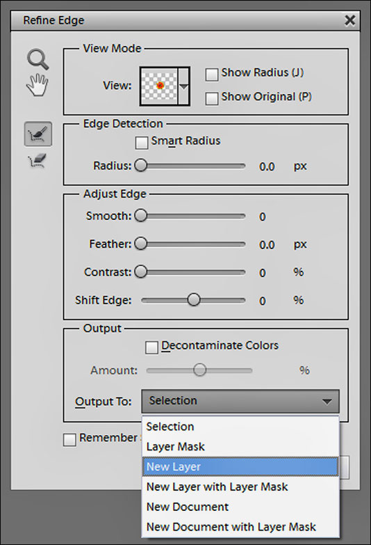
You said you use Elements 11. Starting with this version, Adobe introduced an updated Refine Edge feature (brought over from Photoshop). The Output section in the Refine Edge dialog gives you the choice of having your selection on its own layer. The end result is the same as if you use Ctrl-J/Command-J; Elements cuts out your selection and places it on its own layer.
As a side note -- The Refine Edge command will also allow to you reduce the size of your selection. Just adjust the Shift Edge slider in the dialog box. Enter a negative percentage, ex. -2 %.

|
|
|
|
Post by cats4jan on Sept 29, 2015 17:33:39 GMT
Ken - is there a step missing from your suggestion? (I noticed there is a 1 without a 2) When I do what you said, what I have is a selection on its own layer that when made smaller and moved, shows the original birds layer underneath it. In this example, I made a selection of the birds and when I moved that selection above the original birds, what I have now is two sets of birds. 
|
|
|
|
Post by Major Major on Sept 29, 2015 17:35:09 GMT
Sepiana -
I believe uknomad was referring to resizing the content of the selection, not the selection itself.
|
|
ken1
Junior Forum Member

Posts: 83  Open to constructive criticism of photos: Yes
|
Post by ken1 on Sept 29, 2015 17:38:05 GMT
Janice,
Step #2. Shut off the visibility of the Background layer by clicking on the eye icon.
|
|
|
|
Post by cats4jan on Sept 29, 2015 17:41:09 GMT
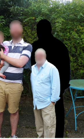
What I assume is happening with OP is my example below - A selection on a background layer - when moved over or made smaller - will show the background color in the void created by moving/resizing the selection.  Without knowing exactly what he wants to do, I am assuming he has something in his photo he wishes to reduce in size. I did not assume he wants to make a selection to put somewhere else. Guess we need him to come back to give us more info. As it stands now, it seems we are all on different wave lenghths.  |
|
|
|
Post by Sepiana on Sept 29, 2015 17:44:31 GMT
Sepiana - I believe uknomad was referring to resizing the content of the selection, not the selection itself. Craig,
I believe you are correct. I checked uknomad's posting history. He had a similar question before -- Reduce part of image without leaving shadow. Unfortunately, there was no follow-up.
I will leave my post anyway. Someone else may benefit from the information provided, especially the one about the new Refine Edge and placing the selection on its own layer.
|
|
|
|
Post by Sepiana on Sept 29, 2015 19:29:54 GMT
As it stands now, it seems we are all on different wave lenghths. ![:o]() Janice,
I quite agree. We need more details from the OP. However, I think Craig is on the right track when he said: "I believe uknomad was referring to resizing the content of the selection, not the selection itself". If this is the scenario, then, it can be accomplished with the suggestions Ken posted. However, I would streamline the process by just having two layers (no need to duplicate the Background layer). Here is my version.
1. Make your selection. 2. Place it on its own layer. 3. Hide the background layer. 4. Use Move/Free Transform to resize the selection.
 |
|
|
|
Post by Sepiana on Sept 29, 2015 20:06:24 GMT
What I would do is like Ken here, but with one extra step. When I have this smaller person on it's own layer, I'll go back to the copied background. I'll then use the content aware tool and select the person. move him out of the way. Let the tool work its way and when the person is moved, but still selected I press the backspace key. Now you go back to the smaller person and place him where you want. Marianne,
Are you talking about using the Content-Aware Move tool (shortcut - Q)? If so, this tool is not available in the Elements version that uknomad said he is using -- "Using PSE 11". I believe Adobe introduced this tool in Elements 12.
|
|
|
|
Post by uknomad on Sept 29, 2015 22:13:11 GMT
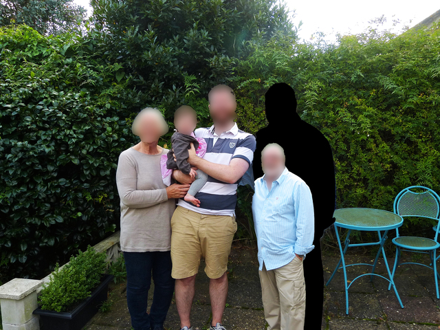
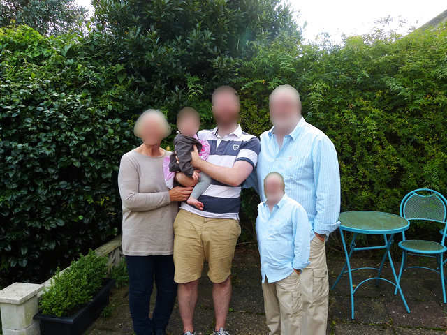
Apologies for the delay in getting back to reply and thank you for all those who have done so. Perhaps the following images may be more useful than my stumbling explanation. This first shows what happens when I selected a person, used move or transform freely to reduce the size - hence the 'black shadow'  If I again make a selection, but place it in its own layer with Cmd J(using Mac) and then resize it, it makes it smaller but merging down produces this:  As someone kindly pointed out, I am using PSE 11 so not all the options/tools suggested are available in that version. Perhaps the solution lies in upgrading to PSE 14 which I am considering  |
|
|
|
Post by Sepiana on Sept 29, 2015 22:39:22 GMT
OK. I see what is happening. I am sure there is more than one way to handle this situation; you could try this.
- Use the Clone Stamp tool or use a combo of tools (Clone Stamp, Spot Healing Brush, Healing Brush) to "remove" the larger version of the man.
- Then, merge your selection layer with the cloned layer.
- Do any necessary touch-up with any one of the tools mentioned above so that your selection will blend naturally with the background.
As a side note . . .
The key to the success of your project is to start with a clean and well-defined selection. I believe the Quick Selection tool is a good one to use. However, just making a selection is not enough. You need to fine-tune your selection before you place it on a new background. That’s where the Refine Edge command comes into play. It will allow you to remove the jagged edges around your selection (Smooth) as well as softening them (Feather).
Note: If you use the Quick Selection tool, this tool has an Auto-Enhance setting on the Options bar. If you turn it on, Elements will automatically smooth your selection edges. However, you will have more flexibility and will get better results if you use Refine Edge as this option allows you to tweak your selection edges.
|
|
|
|
Post by cats4jan on Sept 30, 2015 0:23:56 GMT
 That is exactly what I was talking about. The reason this happened is explained in post 2. However, my explanation will not help you accomplish your task - it was just to help you understand why the black shadow happened -- Why your approach isn't the way to do this. Sepiana's explanation will get you on the road to accomplishing what you want to do. You should be pretty successful since you will be cloning greenery. That is about the easiest cloning to do. You can clone over the man on the original photo or you can clone on the black shadow you created. You do not need to keep your cloning inside the shadow - in fact, overlapping will probably make it look more subtle. Use a brush with soft edges - the cloning will blend easier. |
|