|
|
Post by tonyw on Mar 12, 2016 1:27:08 GMT
Not quite as minimal as I had hoped but I'll go for it anyway as it was taken between rain showers on the California coast - which did make me think I should work on capturing a single raindrop - and we have a lot here at the moment.  Tony |
|
|
|
Post by hmca on Mar 12, 2016 3:43:46 GMT
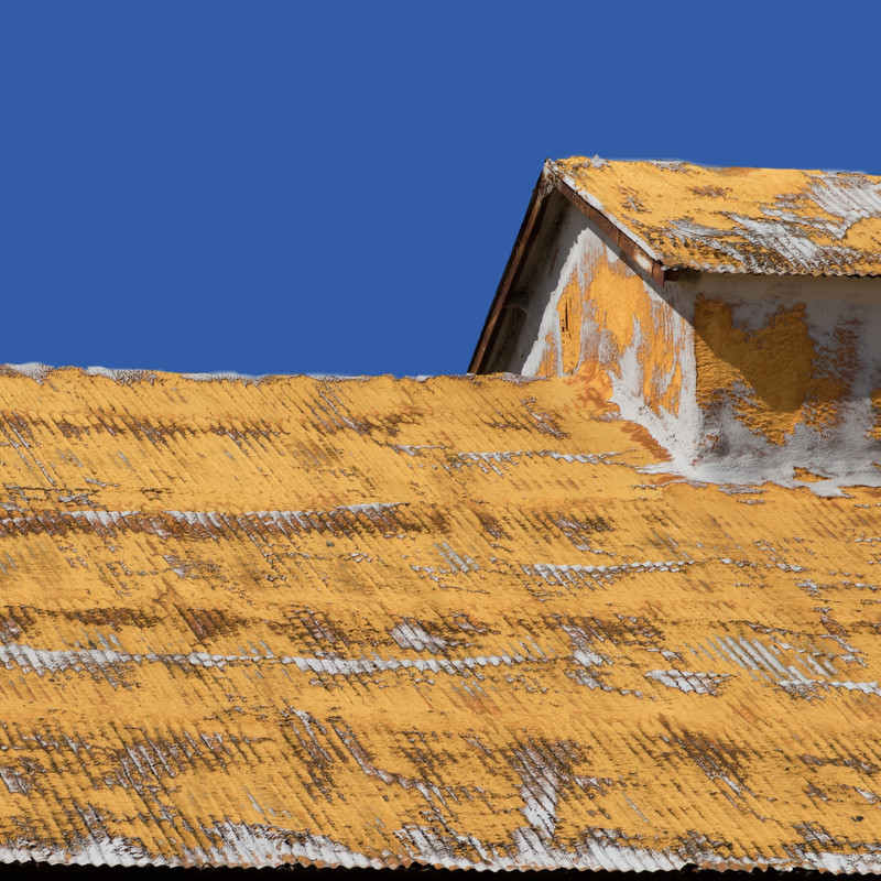
Have been looking at this old building for a long time...Was fun to take some shots there today....think this should work for our theme. Or maybe it should have been less of the roof.....  |
|
|
|
Post by Sepiana on Mar 12, 2016 4:22:38 GMT
Rick – Glad to see you back participating in this challenge. You nailed the Minimalist theme -- negative space, no clutter, solid background, etc. I love the angles and lines.
Tony – I believe you got it. Water and land (rock), two elements only. That’s definitely Minimalist (at least to me). Beautiful image! I can almost feel the swirl of the waves.
Helen – Perfect example of Minimalism (no clutter). I love the bold colors! Glad you took the time to capture this old building.
|
|
preeb
Established Forum Member
 
Posts: 376  Open to constructive criticism of photos: Yes
|
Post by preeb on Mar 12, 2016 7:48:44 GMT
Rick – Glad to see you back participating in this challenge. You nailed the Minimalist theme -- negative space, no clutter, solid background, etc. I love the angles and lines.
I know I've been AWOL most of the winter. This weeks topic is appropriate, because minimal is what this time of year has available for photography, so I have a hard time getting inspired. We have so much minimal that it's really hard to find anything to point the camera at. I drove around the country for 40 miles today and this was all I found worth shooting, and it was only 1/2 mile from the house. This is the photo that I cropped and rotated to create my entry for this week:  |
|
|
|
Post by blackmutt on Mar 12, 2016 14:02:59 GMT
|
|
|
|
Post by tonyw on Mar 13, 2016 0:41:40 GMT
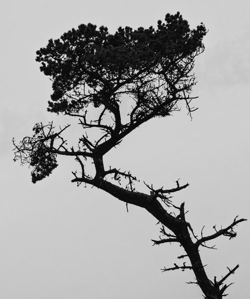
One more. A weather-beaten tree on a cloudy day converted to black and white.

Tony |
|
|
|
Post by Sepiana on Mar 13, 2016 1:05:04 GMT
Rick - I really like your second image (uncropped version). Great composition! I envision your two images displayed side by side on the wall (diptych style).
blackmutt - Both of your images fit the Minimalist theme. I really like the first one. You did a great job interpreting this theme.
Tony - This is minimalist photography at its best. The B&W conversion made quite a difference. Well done!
|
|
dennis9
Established Forum Member
 
Posts: 707  Open to constructive criticism of photos: Yes
|
Post by dennis9 on Mar 13, 2016 19:23:50 GMT
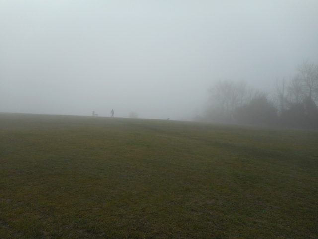
Visibility-wise, this has to be an example of Minimalism. Atmospheric as the scene was, we all felt cheated - the views after a long climb should have been magnificent!  Brenda |
|
|
|
Post by Sepiana on Mar 14, 2016 2:16:45 GMT
Brenda,
Yes, indeed, perfect example of minimalist photography. I love it! Quite an atmospheric scene!
|
|