|
|
Post by hmca on Aug 13, 2018 4:01:57 GMT
|
|
|
|
Post by Bailey on Aug 13, 2018 5:17:58 GMT
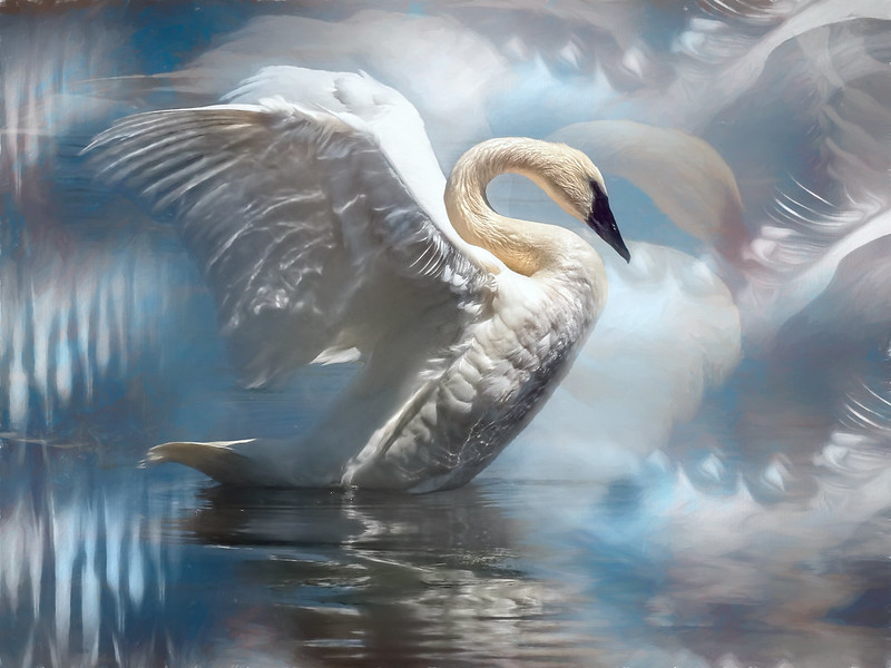
I would like to highlight 3 photos and in alphabetical order of the image title. "Elegance by srmoment" "Elegance by srmoment"Well, what can I say. The image title says it all. Absolutely stunning!!!!
 "European Skipper butterfly. Coaldale, Alberta. August 9 by pontiac1940" "European Skipper butterfly. Coaldale, Alberta. August 9 by pontiac1940"This photo would not have been easy to set up and take. Amazing photo! I really like the colours and detail shown on the subject and background.
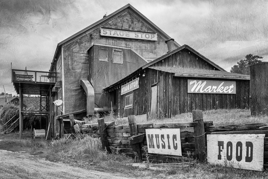
 "The Stage Stop by hmca" "The Stage Stop by hmca"Brilliant B&W image! The full tonal range give amazing depth and detail to the scene and I like that everything is in focus from front to back. |
|
alexr
Established Forum Member
 
Posts: 555
Open to constructive criticism of photos: Yes
|
Post by alexr on Aug 13, 2018 12:32:49 GMT
The three that I would select for my IOW (in the order posted) are: drjoerogers: Golden Hour preview.ibb.co/b2bcWK/golden_hour.jpgThis is obviously way way away from a traditional photo, and I have absolutely no idea how to get to this end stage, but the result is beautiful. One thing I really admire in artists is those that can convey their subject with just a few apparently casual lines. And this does just that. Instantly recognisable yet unconventionally personal. dandc: Cruising the Tracy Arm Fjord lh3.googleusercontent.com/gEC9w8RNLY3ytwm_2Q5YUmogUCIXZ-MhtvcWuamLQW7gIWLrAOCCnfXHqxATZE2ZP0Zfl_Dblns4dqt9Tg=w1024-no-tmp.jpgLove the lead in lines, the symmetry of the left hand slope and its reflection, and the eye settling on the bright blue floe beautifully positioned to then draw your attention up and round to the right. Expert composition and lovely subtle HDR processing to bring out all the detail on an overcast day. deany: This and That image.ibb.co/mQM1Y9/this_and_that.jpgI am sure deany must always get bored of me picking out his/her work but I always love the subtlety of the colour palette, the artistic vision and the execution. Every one is a modern still life masterpiece. But now the colour is gone do I still like it? Crikey, yes, it means I concentrate more on the placement and textures, and these are as good as ever. |
|
|
|
Post by hmca on Aug 13, 2018 15:01:52 GMT
I feel like whippet! I am definitely having a hard time deciding which three images I would like to comment on! However, here goes....in no particular order. Please note that although I was able to do copy/paste on the images above it wouldn't work in my reply.....GRRRR. I added the images using screen shots. Pandanus Fruit by jackscrap I liked the way Jacki combined texture and B/W processing to bring out the reckless abandonment of the leaves and texture of this unusual plant.  European Skipper Butterfly by pontiac1940 My photography instructor is always making us aware of how the use of complimentary colors can enhance our photography. I love the purple/yellow combination that nature provided and the details that Clive so expertly photographed.  The Piano by L. A. Turner As a child I took piano lessons. I wasn't very good but it brought me a lot of joy. After my children were born and I started teaching nursery school part-time, I saved an bought an old upright similar to this piano....but certainly not as ornate. Seeing this image, I was immediately brought back to the joy that old piano brought me. Often what draws us to an image is its emotional impact. I would like to walk up to that piano, run my hands over the wood carving and examine the lovely dishes on top before looking for the bench to see if I could remember any of the songs I used to play.  |
|
|
|
Post by jjr1770 (Judy) on Aug 13, 2018 16:20:57 GMT
Elegance by srmoment Pat does magic with her birds - always beautiful!
Two juvenile mountain bluebirds. August 5. Cowley, Alberta by pontiaz1940 This is a wonderful capture - lots of patience waiting for this perfectly timed shot.
Cruising the Tracy Arm Fjord by dandc Gorgeous landscape making the viewer wonder what's around the corner.
|
|
|
|
Post by whippet on Aug 13, 2018 19:45:09 GMT
3. The Stage Stop by hmca The picture is missing, Helen.
Quote by you.. . . .
I feel like whippet! I am definitely having a hard time deciding which three images I would like to comment on!
I am taking the easy way out. Pass.  |
|
|
|
Post by Sydney on Aug 14, 2018 1:15:36 GMT
Ok, let's continue to spread the love around. After much deliberation and scrolling up and down perusing the bevy of beautiful images on display in the galleries this week my picks that I would like to comment on are:
Golden Hour by drjoerogers
I really like the overall abstract effect of this image and the warm tones of the background texture. I found it intriguing that the clock and tower have a particular pale yellow hue while the dome structure is transparent allowing the background texture to show through. It definitely works for me. This would go well on my wall with an abstract image I created of the Sydney Opera House.
The Bright Getaway Shack by jackscrap
I like the painterly aspects of this image as well as the areas where the effect appears to have been masked out to reveal the original image. It's one of those images that, upon first glance, would cause one to wonder if it was a painting or a photograph. I also like the level of colour saturation for this image and feel it really brightens the overall mood.
Old Masters Painting by blackmutt
This is a work which, I feel, showcases Judy's burgeoning progression with her photography. The dark background and table work perfectly to focus ones eyes directly onto the flowers. The soft illumination coming from the left hand side seems just right by highlighting two thirds of the flowers while the other third are a graduated transition into the background. The two petals on the table are a bonus and really add to the composition. Beautiful work Judy!
|
|
|
|
Post by Bailey on Aug 14, 2018 5:50:55 GMT
... I am taking the easy way out. Pass.  I am disappointed whippet  It's not easy for anyone. But like I was reminded on several occasions in the past, IOW is not a competition. There is nothing at stake here and no winners or losers. IOW in its various formats is just members expressing their views on images and the beauty of "Members Choice", for me at least, is that it shows that the weekly IOW from a single judge is largely affected by whoever the single judge is for that week and what style/type of photos they like. So just pretend you are the single IOW judge for this week and choose 3 images that you like. You don't have to rate them, just tell us why you like them. I hope you have a go, notwithstanding your injured wing  |
|
|
|
Post by Lillias on Aug 14, 2018 9:56:03 GMT
As ever and as we all know this isn't easy keeping ones selections to only 3 from such an array of lovely photos.
FWIW here is my selection.
The Stage Stop by hmca
When I look at this photo my imagination kicks in trying to picture this place when it was alive and thriving so to speak. My mind takes me to the old B&W cowboy films and their stage posts. Although I accept that this is probably an altogether different type of staging post.
The Bright Getaway Shack by jackstrap
I like the composition and the colours of this image and like Sydney I too thought at first glance that it could be a painting or a photograph.
C.W. Morgan at Mystic Seaport by L.A.Turner
I just love all that intricate rigging on the ship which shows up so plainly against that lowering sky.
|
|
|
|
Post by PeteB on Aug 14, 2018 18:47:40 GMT
My three picks are
Elegance by srmoment
Another fantasy-like image from Pat where she again displays her creativity and processing skill. I for one would like to know more about her processing.
The Stage Stop by hmca
When I first viewed this image, I remember reading the Stage Stop sign and then thinking about the history of the building. It wasn’t until I had to write about the image that I had to think about what first caught my eye. My conclusion is the words (signs)….I remember reading that words, like a face or sharp edges in a photo, catch a viewer’s eye. The words (signs) here led me from the bottom of the image up to the top where a sign identified the scene. No caption needed.
Also a nice textured sky which also helps to lead the eye to the Stage Stop sign.
Two juvenile mountain bluebirds. August 5. Cowley, Alberta by pontiaz1940
A great capture and also great cutout work. By replacing the background, the subject is isolated. Nice.
|
|
|
|
Post by whippet on Aug 14, 2018 19:27:10 GMT
I seem to have lost the quote icon from postings.
@ Bailey - My problem is that there are more than three which I think are fantastic.
These are in order of my viewing.
Two juvenile mountain bluebirds. August 5. Cowley, Alberta by pontiaz1940.
I just feel that if I reached out and touched the photo, those feathers would be real. And I have a soft spot for the colours of pale blue and silver grey.
The Pandanus Fruit by jackscrap
I never ever thought that I would choose a b/w picture as a favourite, but the detail of the fruit is amazing.
Old Masters Painting by blackmutt
I also never thought that I would ever choose a still life. But when I saw the bigger size of the picture - it is breathtakingly beautiful.
|
|
|
|
Post by hmca on Aug 14, 2018 20:38:28 GMT
Proud of you whippet......good suggestion, Bailey!
|
|
|
|
Post by dandc on Aug 14, 2018 23:05:17 GMT
Wow, I found it very hard to pick just 3 from this group. In the end my choices, in the order they were presented, are those shots I found myself consistently stopping at as I scrolled thru the list:
Golden Hour by drjoerogers
The colors in this image are so appealing – I’m not sure what the processing was that made this creation but it is indeed eye catching. I specifically like the lighter tones on the main foreground subject along with the darker sky portion and texture work.
Elegance by srmoment
Stunning detail and colors make this a ‘sit-up and take notice’ kind of shot. The creativity displayed is beyond my ability which is probably another reason why I pause to take it all in every time I scroll by.
Old Masters Painting by blackmutt
Masterful processing of a simple composition went into this one. Beautiful light, subtle colors, delicate texture work and the loose petals in the foreground all make for an engaging still-life.
|
|
|
|
Post by jackscrap on Aug 14, 2018 23:59:53 GMT
|
|
|
|
Post by Bailey on Aug 15, 2018 11:55:00 GMT
I seem to have lost the quote icon from postings. @ Bailey - My problem is that there are more than three which I think are fantastic. These are in order of my viewing. Two juvenile mountain bluebirds. August 5. Cowley, Alberta by pontiaz1940. I just feel that if I reached out and touched the photo, those feathers would be real. And I have a soft spot for the colours of pale blue and silver grey. The Pandanus Fruit by jackscrap I never ever thought that I would choose a b/w picture as a favourite, but the detail of the fruit is amazing. Old Masters Painting by blackmutt I also never thought that I would ever choose a still life. But when I saw the bigger size of the picture - it is breathtakingly beautiful. No I don't think you have lost the quote icon. I don't see it either and I think the IOW threads don't have one.
Proud of you whippet......good suggestion, Bailey! No problem hmca and I'm proud of you as well whippet  |
|


