Squirrel2014
Established Forum Member
  Where's that cup of tea ... ???
Posts: 685  Open to constructive criticism of photos: Yes
|
Post by Squirrel2014 on Apr 1, 2016 17:46:13 GMT
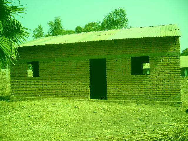
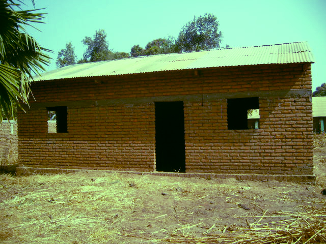
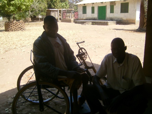
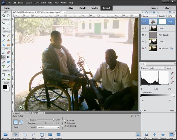
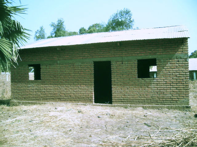
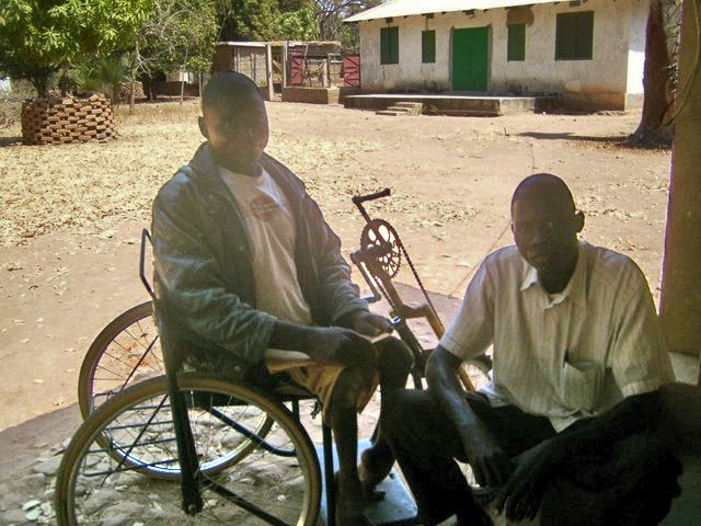
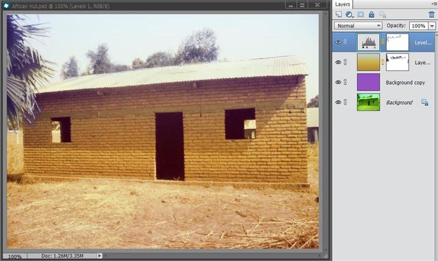
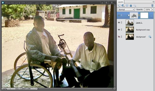
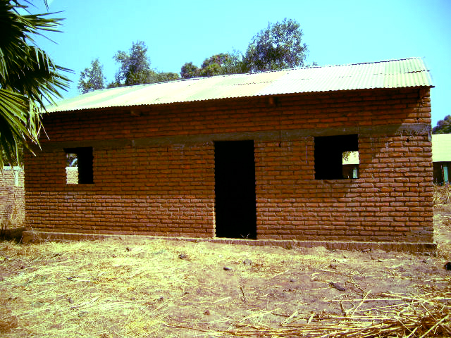
Hi I have been asked by a Church friend, who is a Missionary in Chad, if I can help her with sorting some photos to show during her feedback next week. So, my issue is to Photo 1 (Below) Remove the colour cast in 6 photos and Photo 2 (Below) Lighten the guys in the foreground but without lightening the background (if possible) I have used Bayla's (previously EV member) Removing Colour Cast instructions and they certainly look very much improved but I feel there is still considerable room for improvement, in spite of then using Hue/Sat adjustment. I'm wondering if anyone would be able to advise me as to how to improve, please. In the second photo, it would be great if the two guys could be seen better. They are in the shade with the bright sun outside so it's difficult to see the detail of the wheelchair/bike and the two chaps. I've tried Levels and managed to lighten they guys a bit but, of course, the background becomes much too bright. I've also tried selecting the guys and bike, plus the shaded areas, hoping to be able to lighten them and not the background but as these guys are so dark, it just doesn't seem to work. I've tried inversing the selection to darken it a bit, thinking maybe a blend might help but I didn't like that either. I've also tried with a grey Layer at 74% opacity, above the main photo, with the selected guys above, so that I can adjust the guys separately via the selection and dub the brightness on the layer below. However, I'm still not happy with the result and I'm sure there must be a better and more effective method. Any advice, anyone....  ?? Photo 1 (only one of six) Before Removing Colour Cast - Original [/url]  After Removing Colour Cast  Photo 2 Two Guys - Original  After - as seen in the screen shot. Note the layers etc - for info  Please feel free to copy these images, (for this purpose only, of course, to work/experiment etc and post back. I appreciate any help, ideas and/or advice. I know my friend will be very grateful too.  Many thanks Julie |
|
|
|
Post by Sepiana on Apr 1, 2016 18:23:29 GMT
I have used Bayla's (previously EV member) Removing Colour Cast instructions and they certainly look very much improved but I feel there is still considerable room for improvement, in spite of then using Hue/Sat adjustment. I'm wondering if anyone would be able to advise me as to how to improve, please.
Julie,
You could try this. After you follow Bayla's instructions, do a Hue/Saturation adjustment. Just make sure to select "Greens" in the drop-down menu for the Channels.
Or you could try this alternative.
1. Duplicate the background layer.
2. Apply the Average Blur filter.
3. Change the layer blend mode to Color.
4. Invert this layer (Ctrl-I, Cmmd-I on a Mac).
5. Reduce the Opacity. Try around 50%.
Another possibility would be to use Enhance>Auto Color Correction or Enhance>Adjust Color>Remove Color Cast. Or use the Adjust Color Curves command.
helpx.adobe.com/photoshop-elements/using/correcting-color-casts.html#main-pars_heading_1
In the second photo, it would be great if the two guys could be seen better. They are in the shade with the bright sun outside so it's difficult to see the detail of the wheelchair/bike and the two chaps. I've tried Levels and managed to lighten they guys a bit but, of course, the background becomes much too bright. I've also tried selecting the guys and bike, plus the shaded areas, hoping to be able to lighten them and not the background but as these guys are so dark, it just doesn't seem to work. I've tried inversing the selection to darken it a bit, thinking maybe a blend might help but I didn't like that either. I've also tried with a grey Layer at 74% opacity, above the main photo, with the selected guys above, so that I can adjust the guys separately via the selection and dub the brightness on the layer below.
Try this.
1. Duplicate the background layer. 2. Create a Levels adjustment layer and make the necessary corrections. 3. With the Levels adjustment layer selected, activate the Brush tool (soft brush, color = Black). 4. Paint over the background area in your image to hide the effect of the Levels adjustment. 5. If you inadvertently paint over the foreground area, just switch the brush color to White and paint over the area again to fix the problem.
|
|
|
|
Post by Sepiana on Apr 1, 2016 20:49:02 GMT
Julie, I have just thought of another way to remove color cast.
You could use Color Variations (Enhance>Adjust Color>Color Variations). NOTE: This feature was removed from Elements starting with version 12; the suggested alternative is to use Auto Smart Tone. |
|
Squirrel2014
Established Forum Member
  Where's that cup of tea ... ???
Posts: 685  Open to constructive criticism of photos: Yes
|
Post by Squirrel2014 on Apr 1, 2016 21:28:09 GMT
Sepiana, many thanks for all these suggestions.
I'll give them a try and will let you know how I get on
Needless to say, if I get stuck, I'll get back here to post the issue
Again, thanks very much
Julie
|
|
|
|
Post by Tpgettys on Apr 2, 2016 0:18:56 GMT
Hi Julie, All I did for the first one was try Enhance | Adjust Color | Remove Color Cast, then clicked around until it looked good. I adjusted the Levels after that to get the contrast up. Sometimes the most straightforward approach is close to optimum!  For the second one I found it very easy to select the very dark subjects and then put that on a separate layer. After that just go to work using Enhance | Lighting to bring out the features and contrast. An added benefit of this is that the background can also be worked on independently. These were both proof-of-concept experiments to see how much I could do without working hard. With larger images I suspect better results would be obtained than these.  |
|
|
|
Post by hmca on Apr 2, 2016 0:39:56 GMT
Really nice results, Tom.
|
|
|
|
Post by Lillias on Apr 2, 2016 11:10:14 GMT
1. Duplicate the background layer. 2. Apply the Average Blur filter. 3. Change the layer blend mode to Color. 4. Invert this layer (Ctrl-I, Cmmd-I on a Mac). 5. Reduce the Opacity. Try around 50%. I have a video from Tim Grey which shows this method Sepiana and it's very good. I followed the above and then put on a Gradient layer with a mask layer and brushed back in some of the trees and building and on top of that I put a Levels Layer also with a mask and this is the result. This is the kind of thing that you could tinker around with for hours to fine tune it for a better result. Thank you Julie for giving permission to use your photo, I enjoyed this as an exercise. So far I have not had much luck with your second photo but will keep trying.  |
|
|
|
Post by Lillias on Apr 2, 2016 12:23:29 GMT
This would appear to be the best I can do with the second photo. I duplicated it, made a selection of the men and feathered the selection by 1 pixel and copied to own layer. I then went to > Enhance > Shadows/Highlights – settings Lighten Shadows 87% Darken Shadows 0% and Midtone Contrast +27%. I then Created a Levels adjustment layer – settings 28 1.35 207 and Clipped the Levels layer to the cutout selection layer. On the original duplicate photo layer I went to Enhance Shadows/Highlights and chose settings – Lighten Shadows 41% Darken Highlights 7% and Midtone Contract +55%.  |
|
Squirrel2014
Established Forum Member
  Where's that cup of tea ... ???
Posts: 685  Open to constructive criticism of photos: Yes
|
Post by Squirrel2014 on Apr 2, 2016 12:27:20 GMT
Thanks Tom and Sepiana You've had some excellent suggestions which I've experimented with, mixed some sort-of together and, I'm pleased to say, I think I've now got very reasonable results. For the 1st photo, I followed Tom's suggestion re Enhance | Adjust Colour | Remove Colour Cast, experimented as to the best place to click etc then accepted the result. I then used Bayla's method on the result and found this came up with a pretty good result, pretty much the same as your's, Tom, but I couldn't get the tone of your's (which I liked) So, I did the other 5 green images the same and now have very respectable results.  Regarding the photo with the two chaps in the shade, with the bright background, I used my (saved) selection, copied the original background on to it's own layer, then lightened, as best I could, the guys in the shade. Even on the higher res photo of 800kb, it was still difficult to keep a reasonable image of them so I've settled for being able to make out their features although they are still dark 'ish. I think this is the best that can reasonable be achieved. Sepiana, I'm afraid I haven't yet tried your method of using the brushes because I'd already selected the background/foreground. However, I will give your method(s) a try. I'm sure they will prove to be useful in the future, maybe on a different image. Thanks very much My friend will be so thrilled with the results when I return her flash drive with the adjusted photos on. It's been a very good and interesting learning curve for me too  I will keep these photos to use for teaching purposes now (with my friend's permission, of course) because the improvement has been quite dramatic - a good example of using the tool  Thank you very, very much for all your help and suggestions here. With your permissions, I'd like to keep a copy of the all suggestions on file for future reference, if I may? Julie |
|
Squirrel2014
Established Forum Member
  Where's that cup of tea ... ???
Posts: 685  Open to constructive criticism of photos: Yes
|
Post by Squirrel2014 on Apr 2, 2016 12:38:57 GMT
Hi BillieJean I must have taken a long time to eventually finish my last post because you have posted twice during that time  Thank you very much, I'm really pleased you have also found this to be a useful exercise too. I often gain via the same means when another posts a photo with a problem. I don't post the photo back because I don't feel it's always right, even with permission of the poster but, like I said, I still gain a lot of experience  Anyway, having said that, I really like your suggestions and I'll be watching the video you have mentioned. Thanks very much for this. It'll be a great help. Yes, you too, achieved a very good result with the first photo  The 2nd photo, I think, is a very difficult one to achieve a good result for. My friend admitted she should have gone out into the sun, got the boys to turn around and set her camera accordingly. However, she had been out in the sun a lot that day and didn't really want to go out into it yet again. Obviously, even during our winter period, it is very hot over there Dec-March so I can't say I blame her  Anyway, I feel you have achieved the best possible, to be honest, and I'm really pleased with all these results and delighted others, including you, have benefitted from the exercise  Julie |
|
|
|
Post by Sepiana on Apr 2, 2016 17:00:26 GMT
Julie,
You are most welcome! Glad to hear you "got very reasonable results". As you continue doing this kind of work, you will soon realize there is no such a thing as the definite "recipe" to remove color cast. In the end, it all depends on the kind of image you are working on. That's why it is so important to know all the different ways to fix this problem. For example, I didn't even mention you can also use a Photo Filter adjustment layer or run your file through the RAW Converter and adjust its white balance.
BTW, I forgot to say something very important about using these two Enhance commands I recommended earlier in this thread.
Enhance>Auto Color Correction Enhance>Adjust Color>Remove Color Cast.
- Always use these commands on a duplicate file or on a duplicate layer. These commands are considered "destructive" (as compared to using an adjustment layer, which is considered "non-destructive").
- Also, these commands don't give you much control (as compared to adjustment layers). That's a drawback.
|
|
Squirrel2014
Established Forum Member
  Where's that cup of tea ... ???
Posts: 685  Open to constructive criticism of photos: Yes
|
Post by Squirrel2014 on Apr 2, 2016 17:11:07 GMT
Hi Sepiana Yes, I had already appreciated there is no 'right way', as every photo will be different. Hence, the main reason I wanted to copy all these different methods so I can use them in the future. There's no way I'd remember them all. I have a 'Tutorials' folder and the list is already long, and getting longer!  I hadn't thought of trying to adjust the photos in RAW. I've experimented with RAW not that long ago and was very pleased with what I achieved. I might have another 'play' later, just for 'completeness'  I must make a note of this in the notes too. Also, yes, I'm in the habit of hitting 'Ctrl+J' as soon as I've loaded an image although on occasions, I do forget to. "Just in case"  It also makes a difference if I then want to try something different before comparing the results coz I can then go back to the Background and duplicate it again and then try something else. Thanks for pointing it out, though. Julie |
|
Moto
Established Forum Member
 
Posts: 662  Open to constructive criticism of photos: Yes
|
Post by Moto on Apr 3, 2016 16:49:40 GMT
Julie's image after Removing Colour Cast

My image starter is Julie's image after she removed the color cast.

Selected the sky. Levels/ Blue.
Seclected everything except the sky. 2nd Levels layer - rgb and green adjustments.
|
|
 ??
??


 ??
??