|
|
Post by hmca on Apr 23, 2018 1:19:26 GMT
|
|
|
|
Post by jackscrap on Apr 23, 2018 2:41:33 GMT
I would like to give a vote for the Stilt walker by PeteB. Great subject and I love how the Mum and the boy are making eye contact with the walker, but the Dad is more amused by the child's reaction/attention to the walker. 2812blog.files.wordpress.com/2018/04/ap_7085.jpg |
|
|
|
Post by jackscrap on Apr 23, 2018 2:46:30 GMT
|
|
|
|
Post by jackscrap on Apr 23, 2018 2:50:59 GMT
Winter wonderland by Rapata gets another vote - all those lovely long shadows, crisp blue sky, creepy trees and of course the snow all brought together by the fence line leading my eyes around the scenery. preview.ibb.co/kYaHHS/IMG_3337.jpg |
|
|
|
Post by Bailey on Apr 23, 2018 3:56:35 GMT
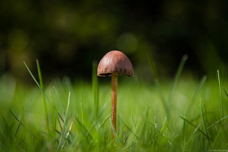
I would like to highlight 2 photos and strictly in alphabetical order of the creator. "A lonely mushroom by alexr" "A lonely mushroom by alexr"This photo would have taken a bit of planning and effort to get down to the "eye level" of the mushroom as opposed to taking a "snapshot" from standing above. I really like the use of a very shallow depth of field to isolate the mushroom (the subject of the image) and make it pop from the background. Whether the shallow DOF was achieved solely by camera settings and/or post processing doesn't matter. I suspect most if not all the DOF is achieved by the camera settings. I also really like the way the detail in the highlight on the mushroom's head is not blown out, either by correctly exposing when the shot was taken and/or in post.
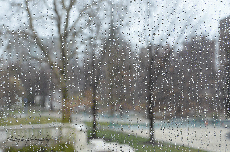
 "It's an Art Thing by kathylee" "It's an Art Thing by kathylee"I am by no means an expert in art type photography but I know when I like something. I can't put my finger exactly on it, but the way the rain drops on the glass play some sort of role filtering the blurred background gives me a sense calmness and mystic. I suspect manual focus was used to focus the rain drops on the glass. In auto focus mode, I suspect most cameras would focus on an object through the glass in the background resulting in a sharp background with the rain drops out of focus. Then again, maybe the rain drops on the glass is a separate photo layered on top of the background. Either way, the effect on me when I look at the photo is the same. |
|
|
|
Post by Lillias on Apr 23, 2018 11:03:35 GMT
My biggest problem here was limiting myself to choosing just 3 images.
I will apologize at the start for the standard of my comments. Not being a photographer I don’t have the knowledge to comment on the expertise of the photograph or photographer but I know what I like when I see it.
In the order they are presented to choose from, here are the three I have eventually settled on.
806 Randall St. by drjoerodgers
I love the subject matter and the colours of this image and I think the image lends itself well to the sketch effect that has been applied.
April 19 will it ever warm up? By kathylee
This image for me has a timeless quality to it and could have been taken in any era.
Cherry Blossoms by hmca
This caught my eye the first minute I saw it. It evokes images of spring/summer for me. The effects that have been applied give softness to the image and I love the colours. It could be hand painted and I’d have it on my wall any time.
|
|
|
|
Post by hmca on Apr 23, 2018 15:21:37 GMT
My choices for this week in no particular order are:
Among the Mustard by dandc
I was drawn to this image immediately. I like the soft ethereal feel that the background creates
and the fact that the bird is perfectly placed in the frame.
It's an Art Thing by kathylee
I have always liked these rainy window images. Kathylee's is enhanced by the simplicity
and muted tones and shapes in the background.
The Stilt Walker by PeteB
I agree with what Jacki said about this image. In addition I like the creative processing
.......a signature style developed by Pete that makes his work readily recognized.
|
|
|
|
Post by whippet on Apr 23, 2018 17:47:39 GMT
Quote Billie Jean - My biggest problem here was limiting myself to choosing just 3 images.
I will apologize at the start for the standard of my comments. Not being a photographer I don’t have the knowledge to comment on the expertise of the photograph or photographer but I know what I like when I see it.
In the order they are presented to choose from, here are the three I have eventually settled on.
As you know, this applies to me, too. And I too, had difficulty choosing.
These are my three.
Sunflower - jackscrap. I love the embossed effect, and the depth of this image. Looks like an oil painting to me. The different colours in each petal and leaf make the picture look amazing.
Cherry Blossom - hmca. What a peaceful, serene image this is. I would love to have a large version of this hanging on my bedroom wall. The worries and cares of the day would soon fade away when looking at it.
Among the mustard - dandc. This is fantastic - the way the bird stands out, and how some of the branches are also clear, while others - and the flowers - are part of one of my favourite effects - blurring. The pastel shaded colours really compliment the dark colour of the bird.
|
|
|
|
Post by drjoerogers on Apr 23, 2018 18:04:34 GMT
The Worker gets a big 'thumbs up' for creative perspective ( shot from above ) and classic composition. A+ for Helen
Among the Mustard. At his usual best, dandc tries to trick us into thinking the bird is the primary object. Not so fast, Dan. We all know it's that glorious negative space of yellow mustard which is the headliner.
|
|
|
|
Post by dandc on Apr 23, 2018 19:31:22 GMT
My choices - in the order they were presented are . . .
06 Randall St. by drjoerogers
This image really appealed to me because the processing fit the subject perfectly and helped to convey a warm feeling of home. The coloring is gentle like the scene and the composition draws the viewer in where, if you move closer, you can almost smell something in the oven.
Tower of London by Simone
The contrast between the warmly lit windows and the darkened walls made this shot stand out for me. To imagine yourself strolling by and seeing this scene isn’t hard to do. I think this is a good example of an image with many attributes to keep the viewer in place for awhile.
The Worker by hmca
The composition in this shot just makes me sit-up and notice. I’m not sure if it fits the ‘Golden Ratio’ or just some version of ‘Rule of Thirds’ but it takes my eyes on a journey thru the scene. The B&W tone is superb, the contrast between darks and lights captivating.
|
|
|
|
Post by Sydney on Apr 24, 2018 3:11:57 GMT
Choosing just 3 is very tough. I could think about this tomorrow and my picks might vary slightly. But as of the here and now my selections would be (in the order they appear up top):
Sunflower - jackscrap
I really like the artistic look of this and have to admit alot of my processing of late has been gravitating towards a more painterly look. I like the tight crop of the sunflower and the complementary blue and yellow hues with so many multiple tones of each. Nice!
Among the Mustard - dandc
This is such a sweet, beautiful and well composed image. I love the depth of field which gives the mustard a soft blur while keeping the bird sharply focused. From a technical standpoint the bird looks positioned right in the sweet spot of the rule of thirds.
The Worker - hmca
To me this is the epitome of black and white processing and a gallery standard image. I love the unique perspective and the well composed symmetry and contrast between opposing diagonals. The tonal contrast is perfect between the worker in the field and the grass to really make him stand out as the focus of the image and totally complete the picture. I could see someone paying good money for this to hang in pride of place.
|
|
|
|
Post by PeteB on Apr 24, 2018 13:24:19 GMT
Great images posted. Here are a few of my thoughts.
While the Red-winged Blackbirds Sang (dandc)— I like this composition. It has both advancing (yellow) and receding (green) colors. The yellow flowers in the foreground immediately grab your attention and pull you into the image. The yellow flowers then lead you to and around the lone tree. The green (receding) background adds depth to the image. Finally, both the tree and the horizon are accurately placed on the thirds.
The Worker (hmca)—-I’m still trying to decide what the secret is of this composition. Is it the use of diagonal lines that lead into the image? Or, perhaps it’s the 4 implied triangles (that contain diagonals). Then again, maybe it is simply the placement of the subject...… a great image.
Local Color (kathylee)—For me, a fun image. When I first saw this it brought a smile to my face. Sometimes color is the subject.
Sunflower (jackscrap)—I like sunflowers and I am curious about the processing.
|
|
rapata
Junior Forum Member

Posts: 246 
|
Post by rapata on Apr 24, 2018 20:06:27 GMT
It was tough to choose just three, but in no particular order I decided on
806 Randall Street by Drjoerodgers - the bright colours and clean lines immediately caught my attention, and the sketch effect fits the subject perfectly
Cherry Blossoms by HMCA - such a pretty soft image, which shows off the gentle softness and colour of the blossoms to perfection
The Worker by HMCA - another masterpiece by Helen - I am not exactly sure what it is about this image that appeals, but as soon as I saw it I knew it was a winner.
|
|
alexr
Established Forum Member
 
Posts: 555
Open to constructive criticism of photos: Yes
|
Post by alexr on Apr 25, 2018 7:35:21 GMT
Firstly, Helen, thank you for bringing this feature to life from Bailey's original suggestion; I hope it will prove to be a popular addition to the IOW repertoire. As I have said on previous IOW threads, I find one of the best ways to develop my own skill is to analyse what I like about other people's work, and the act of then writing this down really consolidates this process. Plus it is always pleasant when someone says something nice about one of your images. Maybe I'm shallow, but I get a pleasant frisson, so thanks to those that have already contributed.
My three highlights, in the order displayed:
Untitled by Blackmutt. I love it when someone sees something fairly mundane (like a bridge fence) but then by their vision, turns it into something artistic. Repeating patterns always work really well to create an abstract image, and the interplay of the fence and shadows work perfectly for me. But what I really like is that at first glance it isn't obvious what it is, but there is enough there that makes you want to look into it more deeply to see exactly what it is. And then you are hooked.
Sunflower by Jackscrap. Talking of artistic vision, this is into the next level. I love the skill shown in creating this image so seamlessly. The subject emerges brightly from its surroundings due to the lovely 3D effect. And at first I think it is a photo of some ceramics, and then I spot the underlying texture and think it is oils on canvas, so its an image that keeps you thinking and engaged.
The Worker by HMCA. A masterclass in composition of diagonals and triangles. But it is the unusual point of view that grabs you (how did you get there?), and then you have thrown in the added texture of the flowing grasses complemented by the circular hat, and the subtle but expert processing to highlight the edges of the clothing. Wonderful, and one of my images of the year, not just the month.
|
|
|
|
Post by Sydney on Apr 25, 2018 17:15:17 GMT
So pleased to see that everyone has got a look in so far. Just goes to show that art and photography are very subjective areas!
|
|


